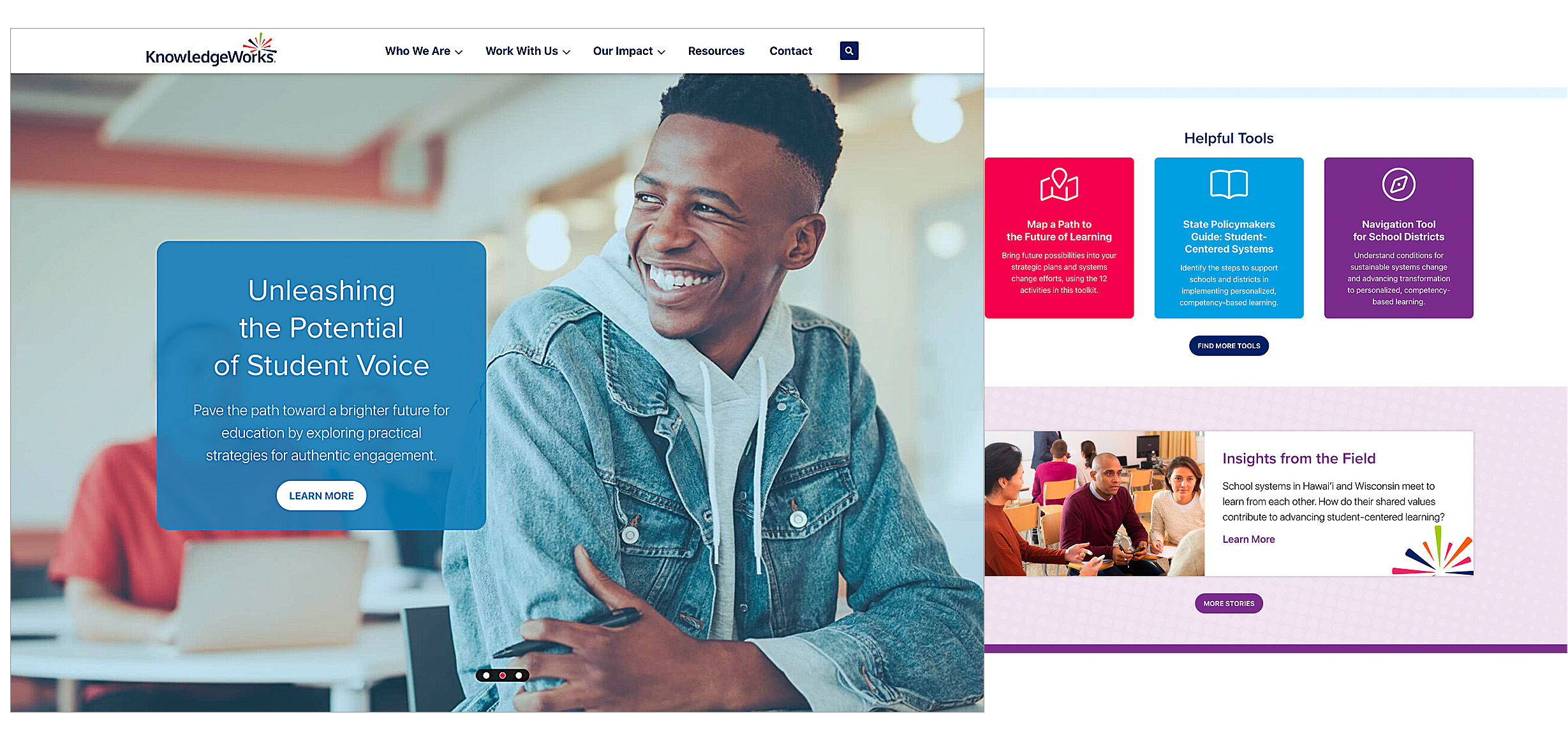
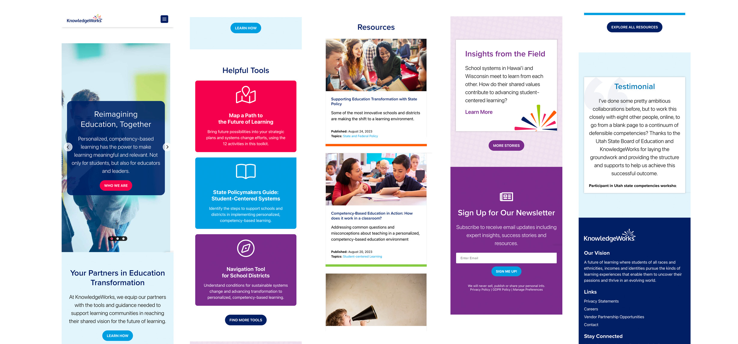
But reorganizing and redesigning their site wasn’t a simple ask. KnowledgeWorks was also wading through:
- Strategic and organizational change, including a shift to elevate and focus on two of their audiences without neglecting their other three secondary audiences.
- Rigid website templates that were a bear for the team to maintain.
- The integration of studentsatthecenterhub.org — a separate entity with a site structure of its own — into the new KnowledgeWorks parent site.
- Massive amounts of content from both entities that needed to be audited and migrated.
- Inaccessible site pages for people with disabilities.
Every project we take on begins with research to inform a comprehensive, evidence-based strategy. Keep reading to see how we tackled these tasks for KnowledgeWorks.
Project
Research and strategy work to inform accessible site design
For KnowledgeWorks, our research took the form of conducting a thorough review of both websites, their latest site analytics and their industry peers’ websites.
We conducted a comprehensive content audit for both websites. The inventory allowed the KnowledgeWorks team to identify which pages did or did not align with the organization’s larger goals and updated primary audiences, based on analytics we incorporated within the spreadsheet.
The findings from our research led us to our strategic recommendations for their new website’s information architecture and projected user journey. We created a new sitemap and wireframes to inform our design. We bundled our final designs into an organized package for KnowledgeWork’s development team to easily implement, as requested.
Results
A navigable, flexible and accessible website to reflect the nonprofit
KnowledgeWorks’ new site is not only fresh and aesthetically pleasing, but also more practical to navigate for users and easy to track and maintain for the client.
Specifically, the redesigned site:
- Accurately communicates KnowledgeWorks’ services while celebrating their unique brand.
- Establishes KnowledgeWorks as a leader in their industry, reaching one of their main goals.
- Creates opportunities for site visitors to support existing partnerships and/or build new ones.
- Features a color palette and fonts that meet WCAG 2.1 level AA for web accessibility.
- Intuitively integrates content from the Students at the Center Hub site.
- Allows for straightforward site maintenance for the internal team.
We also provided recommendations for ways to track and monitor user engagement on the updated site. If the KnowledgeWorks team witnesses a dip in user engagement, they can easily identify where visitors are dropping off and seamlessly update the platform, avoiding site stagnation. The digital style guide we delivered to the client also supports future design updates.


