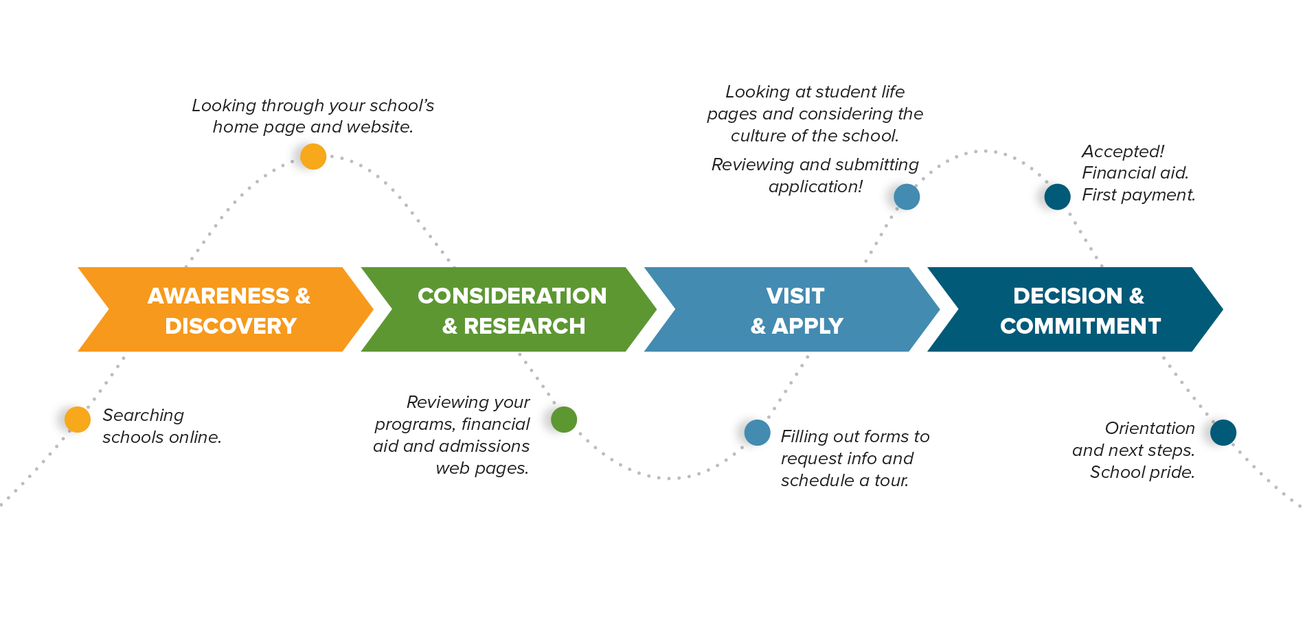
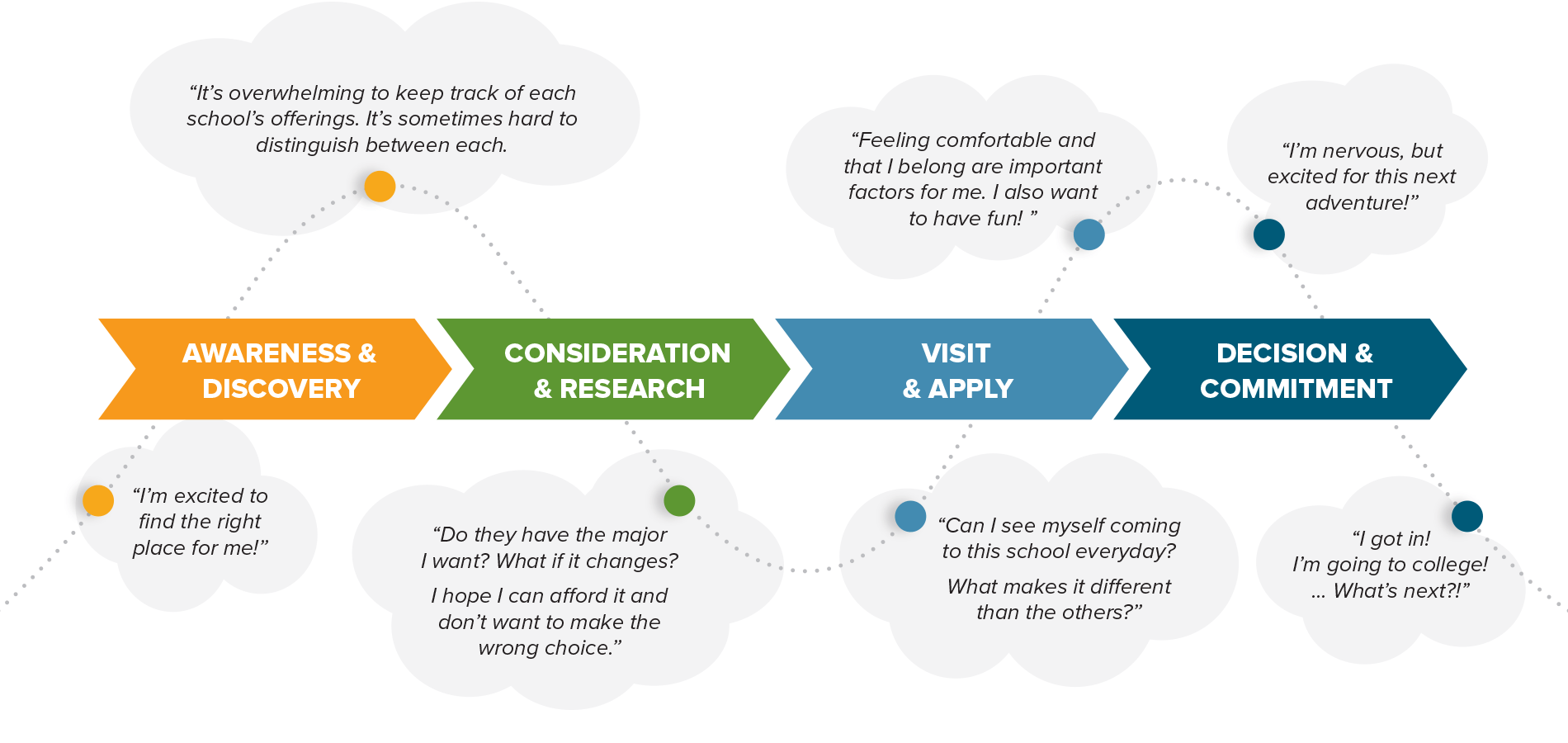
Understanding your prospective students’ experiences at each stage of their journey is crucial for turning marketing insights into concrete and proactive engagement strategies for your school.

Building out a detailed, big-picture journey map of your student applicant process will help you evaluate your school’s existing recruitment and website experience to identify the hurdles and challenges students face along their journey. Harnessing this kind of tool can help you get buy-in from other colleagues and departments around what kind of strategic enhancements need to be made on the website and in recruitment outreach.
So what exactly is a journey map?

A journey map is the documentation of each touchpoint that a prospective student will most likely have with your school during their search and apply process. Built off of your school's unique user research, web analytics and usability testing, a journey map pinpoints the key information students are seeking, the actions they're taking and the emotions they're feeling — from the awareness stage all the way through to the commitment stage.

Having these insights will help you make better data-driven decisions that resonate with prospective students at each stage of their college selection journey.
Why you NEED a journey map
- It reminds your team to always look through the lens of a prospective student
- It helps to identify areas for improvement throughout your student applicant life cycle
- After a journey map is created, it becomes a valuable student-centric tool for your team and the cornerstone for decisions regarding your recruitment strategies and website experience
- By identifying and alleviating pain points in their journey, you will be building trust with your users, guiding them towards a successful application experience and setting the stage for long term loyalty with your school
A journey map can help answer crucial questions:
- Is our website user-friendly, and more importantly, is it meeting prospective students’ expectations?
- Why are visitors getting to the home page but never going any further?
- Where is the biggest disconnect or drop-off within our applicant life cycle?
- What are the biggest student pain points that we need to alleviate within our website experience?
- Where within the recruitment and application process are students facing concerns or hurdles that are keeping them from committing to our school?

How to get started
1. Focus in on your key prospective student audience types
Identify which key groups of prospective students you what to target the most (e.g. high school graduates, program or degree-specific students, transfer students, international students, adult students, etc.).
Dig into what the unique needs are for each of these groups. You may want to build tailored journey maps for each audience – framing their specific patterns of behavior, mental models and identifying observed pain points and goals for each group.
This kind of data can be gathered by conducting focus groups, surveys, usability testing of your current website, reviewing web analytics, etc.
2. Identify student goals at each phase, then determine corresponding tasks and touchpoints
Start to analyze the current path of the actual online journey these prospective students would take through your website, documenting each step they’d make from beginning to end. Evaluate how easy or difficult it is to intuitively find the information they want on your school’s site and to submit their application.
You can conduct focus groups and usability testing with actual students from each audience to understand the process students expect to take and how they believe your site’s experience should work. How can you make their experience as intuitive and enjoyable as possible? This is also a great time to conduct a competitive analysis of other school’s website experiences and their recruitment messaging to see how your site stacks up.
3. Plot it all out!
Once you have this stronger understanding of your student’s journey and pain points, you can now work to guide them through each stage of the applicant process with targeted content and an enhanced user experience along each touchpoint.
An example of bringing this to life could start with enhancing your search engine optimization and redesigning your home page messaging and structure. Fine tune these areas to successfully grab prospective students’ attention and establish an emotional connection. Help them visualize themselves at your school.
From there, how are you guiding them from the home page to the next important step of their journey? Is it easy to find and explore your programs and admissions information? As students continue their journey, they want to request more information and really begin digging into your site, so be sure to provide helpful content and callouts to more relevant information.
Make sure that every webpage they touch provides a guiding hand to the answers to all of their questions. In this way, your messaging should evolve through these pages as they dig in further. How user-friendly are your forms to request information, schedule a tour and apply? Are your web pages easy to scan through and engaging? What if your analytics show that people aren’t getting to certain pages from the home page? What does your outreach consist of after the student has applied or been accepted?
By alleviating hurdles found at each stage of the journey, you can start increasing conversion rates and set yourself apart from other schools’ sites that fail to meet student expectations.
Measuring success
Your site should always be growing and adapting to your users’ needs, therefore your journey map will need to evolve over time with the site. It’s important to regularly plan on monitoring and evaluating the effectiveness of your site’s user experience.
These journey maps should be an evolving document that you keep up to date. In this way, they will remain a useful tool in making sure you’re reaching the right students for your school and hitting your admissions and recruitment goals!