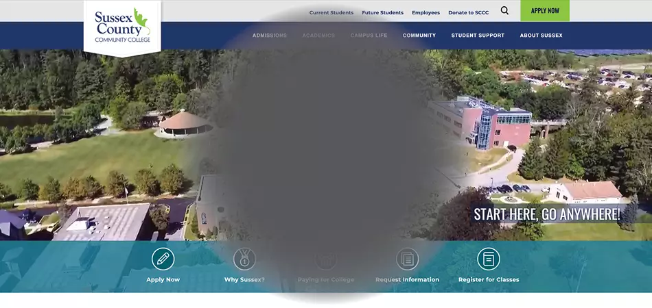
Sanger & Eby's Chief Technology Officer, Mike Welch sat down with Michael Schilling, a friend who has macular degeneration (one of many causes of low-vision). Their conversation highlights the importance and urgency behind website accessibility and inclusivity in website design.

Interview by: Mike Welch
Sanger & Eby recently had the opportunity to conduct usability testing on the Cincinnati Art Museum’s (CAM) website with users of varying visual, auditory, mobility and cognitive abilities. While we have always understood that each user’s experience is different from the next, it became even more apparent during our user testing with CAM. In an effort to gain deeper understanding of how website accessibility affects the individual experience, I sat down for an interview with Michael Schilling, a friend who has low vision.
Getting to know Michael Schilling
When you first meet Michael, you may not know that he is legally blind. However, Michael has macular degeneration, an eye disease that causes vision loss that will continue to get worse over time. He can see outlines of people in a room, but he can’t always make out faces.
Michael didn’t attend a school specializing in educating students with a vision disability. Instead, he went to school alongside fully-sighted students and had to work extra hard to adapt and complete tasks in his daily life, including using the internet.
Navigating the internet with low vision
Like most people, Michael uses the internet on a daily basis. He has a MacBook and an iPhone, but he prefers to use his phone as his primary device for accessing the Internet. Due to his low vision, Michael needs to hold his devices within a few inches of his right eye in order to see what is on the screen. He can easily bring his iPhone into view, while his laptop is just too large for him to comfortably use on a regular basis.
Some people with a vision impairment rely on screen readers (external software that reads the contents of a page out loud) or text-to-speech (TTS) technology (screen reader software available through a device’s operating system). While others use screen magnifiers (tools that magnify what is on screen up to 4 times the original size). In Michael’s case, he prefers to pinch and zoom while browsing websites. First, he views the overall screen, then he zooms in to the area with the details he is interested in. If he needs to read an entire paragraph of text, he highlights the text and uses his iPhone’s built-in TTS to have the information read aloud to him. If he uses a website or an application that is not built to allow pinching and zooming, he will quickly take a screenshot, switch to his photo app and zoom in there.
“I tend to come up with non-traditional solutions to a problem. If there’s something that my phone’s screener won’t read, I can just screen shot it and go to my camera roll, and zoom in more.”
When I asked Michael why he doesn’t use a screen reader with headphones when he’s in public, he noted that he relies greatly on his sense of hearing to understand what’s going on around him and that headphones take away his situational awareness.
To Michael, it’s second nature. To me, I am impressed by the adaptations Michael has developed in order to interact with the digital world. It emphasizes why we strive to create digital experiences at Sanger & Eby that are useful for people of all abilities.
What are the common hurdles he faces?
We talked about variety of issues that he faces every day, and many of these issues are common among people with disabilities:
The first hurdle he mentioned was websites that use colors that don’t provide enough contrast. They might look appealing to people with full vision, but they are designed with light colors that blend in together. Higher contrast is needed for individuals with vision differences.

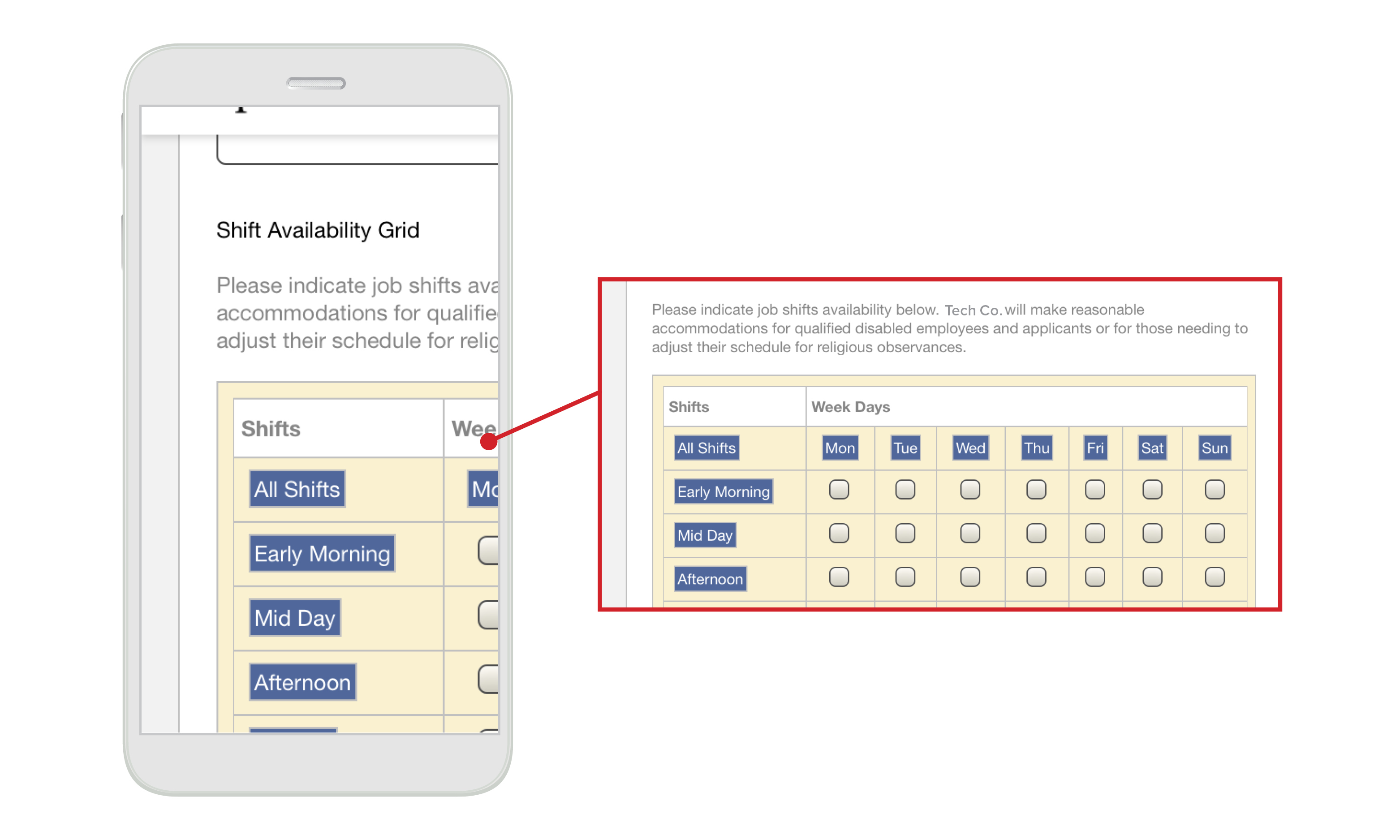
Many sites either don’t allow for increased magnification or don’t handle it well. For users like Michael who rely on zooming significantly, even on responsive websites, it isn’t enough for the fonts to get bigger, but the words shouldn’t overlap and the text should reflow properly. This is especially difficult with online forms. Sometimes, Michael struggles because the pages don’t layout properly when using a large font size, which is most common with forms. The elements of the form can move off the screen or overlap with other elements, making it difficult to complete.
“A lot of my struggles come from poor user interface design. Does this site actually make sense?”
When presented with information in a large table, Michael can get overwhelmed. On his phone, he often has to scroll side-to-side. If the information were presented differently, in a more linear fashion, he could scroll through it vertically. Presenting information in lists rather than tables helps users with screen readers, too. Avoiding large, complex tables also helps with overall responsiveness.

What can we take away from Michael and this conversation?
Every decision we make as designers and developers can have a big impact on your users and this is why these conversations are so critical. Make connections, start conversations and educate yourself about what users’ needs are. Talk to them face-to-face.
Each person is unique in their approach to using technology and the internet. This is why it is so important to consider a wide spectrum of users with differing levels of abilities. Inclusive design should offer multiple modes of navigation.
Don’t make assumptions. Not all Internet users who are blind use screen readers. Not all people with low vision use screen magnifiers. Your website should be built to allow users to make adjustments and interact in a way that’s best for them. Flexibility is key, so offer multiple paths for your users.
Design inclusively from the very beginning. The last thing you want to do is create barriers for people through the choices you make when designing and developing websites.
Thanks to Michael Schilling for sitting down with me and having this conversation.
If you have questions about your website's accessibility, get in touch!