Inclusivity in your website shouldn’t be an afterthought. A website that isn’t accessible may prevent as many as 1 in every 4 adults from using and navigating your site.
Why? Differences in ability can range from mild to severe, temporary to permanent and can be related to motor skills, cognitive abilities, seizure disorders, vision and hearing. Therefore, when you’re making design decisions for your website, there are a lot of factors to consider regarding varying levels of ability.
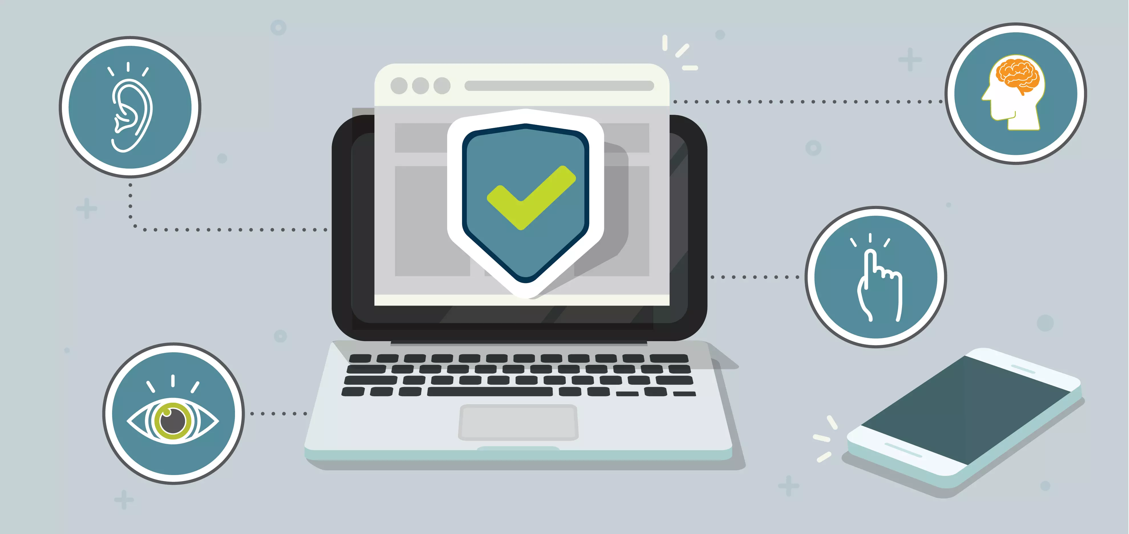
That is why we’ve created these quick tips to get you started with creating an accessible experience.
1. Use colors with sufficient contrast.
Users with visual impairments may not be able to access content without sufficient contrast. Increasing the contrast between colors on your site allows everyone to access the content you have to offer. There is a lot that goes into it, but luckily, there are websites like Contrast Checker and WebAIM that can help you test whether or not your colors are accessible.
2. Don’t rely on color alone to convey meaning.
For example, don’t just indicate an error on a web form by changing the color to red. Approximately 7% of men in the U.S. – about 10.5 million – who see red and green differently than others might miss those visual cues. So, when you do use color, consider accompanying it with an icon and/or message too.
3. Choose fonts that are clear, readable and scalable.
Overly stylistic or decorative fonts can be hard to read for people with dyslexia or other vision and cognitive learning differences. Gravitating toward san serif fonts and readable serif fonts will ensure your copy is accessible to everyone. Making sure your content is scalable also ensures access to screen readers and other learning aides.
Read more: How does website accessibility affect low-vision internet users?
4. Be consistent.
Users look for and follow patterns within websites. From text, link and button styling to where certain components are located on a page, consistency is key. When you change a pattern, or try to reinvent widely accepted internet practices you can cause confusion, not just among users with disabilities, but with everyone navigating your site.
5. Be careful with animated components.
Avoid flashing images, loud colors and patterns that may trigger seizures.
6. Make sure you include GOOD alt text on images.
Alt text is a “behind-the-scenes” element that describes the content and purpose of non-text elements like images, icons, animations and more. Alt text gives a vision-impaired person using a screen reader access to non-text elements, but it can also be helpful if an image does not load due to a server error or slow connection. This article by Moz includes some great tips and examples.
7. Include captions/transcripts on audio and video.
Captions allow someone who is hearing-impaired access to your content. They also enable someone in a noisy space without headphones to access your content without audio. Additionally, captions can help someone who is not fluent in the posted language and struggles with accents. If you need help, there are services like Temi who will transcribe video and audio for you.
8. Write content that is simple and concise.
Avoid long paragraphs, utilize bulleted lists and avoid jargon and abbreviations.
9. Write clear calls-to-action.
Avoid vague calls-to-action and sneaky links that try to persuade users to do something. To someone with cognitive disabilities, it is not clear what the call to action is and they are likely to leave your site without completing any action.
10. Stop using “Click here” and “Read more” as your link descriptions.
Most people just scan content, so writing meaningful link descriptions will help users get to where they want to go quicker. Similarly, a site visitor using a screen reader would have to listen to an entire page for context because “click here” offers no value. Nielsen Norman Group offers some great tips for writing great links.
Read more: Your diversity, equity and inclusion efforts are disingenuous if you discount accessibility
We understand that these tips may be hard to tackle for outdated websites with one too many “quick fixes” or patched up code. Let’s talk about your pain points, accessibility must-haves and what recommendations we may have for your site.