User Experience (UX) enhances productivity for Macy’s distribution centers

With multiple distribution centers employing thousands of workers across the United States, Macy’s is always looking for opportunities to improve operations, drive productivity, and increase efficiency. They came to Sanger & Eby with an ask to streamline the experience of three disparate applications used across their distribution centers.

Challenge

Macy’s internal technology team had developed a powerful suite of applications for their Warehouse Management System (WMS). While the tools were meant to simplify and optimize operations within Macy’s distribution centers, they offered a sub-par user experience, costing extra resources through employee training and issues of productivity.

Services:

Focus groups & stakeholder interviews Information architecture development User experience planning & user interface design Data architecture Custom Application Development

With multiple distribution centers employing thousands of workers across the United States, Macy’s is always looking for opportunities to improve operations, drive productivity, and increase efficiency. They came to Sanger & Eby with an ask to streamline the experience of three disparate applications used across their distribution centers.

Services:

Focus groups & stakeholder interviews Information architecture development User experience planning & user interface design Data architecture Custom Application Development

Challenge

Macy’s internal technology team had developed a powerful suite of applications for their Warehouse Management System (WMS). While the tools were meant to simplify and optimize operations within Macy’s distribution centers, they offered a sub-par user experience, costing extra resources through employee training and issues of productivity.

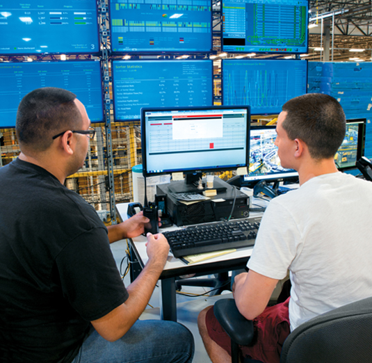
Two casually-dressed male employees in one of Macy's distribution centers sitting in front of several computer screens showing  unidentifiable charts and data.

Strategy

Macy’s distribution centers are a critical part of the company’s fulfillment strategy, so the ease of use and efficiency of the Warehouse Management System applications is crucial to the company’s success.

To create consistency in the user interface of the three applications, we first needed to identify and understand user needs and challenges. The Sanger & Eby team performed one-on-one interviews with Macy’s employees who use the warehouse systems daily and we conducted on-site research to understand warehouse operations. During this process, we learned the vocabulary and nomenclature used by warehouse associates; terms like “picking,” “packing,” “waves” and “storage optimization.” We learned the difference between a “replenishment wave” and a “picking wave.”  This knowledge was essential in helping us to understand their warehouse management system so that we could optimize its web components and experience.

After completing our research, the Sanger & Eby team worked collaboratively with Macy’s internal staff through a series of 3 web development phases, called sprints. With each sprint, specific pages were identified and redesigned based on our findings during research. Our senior designers and developers provided consulting during each of the sprints to ensure successful implementation.


Results

Sanger & Eby created a fresh, user-focused experience for the users of the Macy’s 3 Warehouse Management System. We designed a custom system that has solved Macy’s challenges, deepened user engagement, increased efficiency and reduced costs. Now, Macy's warehouse employees have quick access to information and process flows that are relevant to them. This has served to reduce confusion, increase efficiency and drive higher user satisfaction and engagement. Users of the system welcomed the changes and the consistencies in the menus and application structure.


Do you need help locating opportunities to improve operations, drive productivity, and increase efficiency? Let’s talk!